Cookies for the Caribbean (Chris Work)
–
Q: Why do you have a Brutalist Website?
A: When I started this project, my intention wasn't to create a brutalist website. I wanted to create something that was fun, and little unexpected with a certain level of sophistication. But the site has various forms of brutalism. I actually didn't even think about this until someone asked about the style in a Webflow forum. They were wondering what I called it. My work has a certain style, but I don't restrain my execution to it. I always identify what the purpose of the design is, what it should do, and how it will be used.
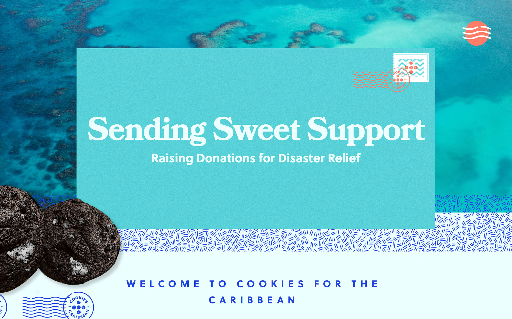
The intention of the site was to create a fun experience while interacting with it. The layout is very stripped down and straightforward. The goal was getting the user to donate funds and receive cookies in return. To create a happy feeling, I applied the use of bold typography, emojis, bright websafe colors, and patterns. The patterns are from the inside of an envelope I had in my office. Because the cookies are delivered mail, I used familiar iconography to reflect the postal service in the design language. To support this I used stamps, envelopes, and inked postal registration stamps.
Q: Who designed the website?
A: I designed it. Chris Work, wrkhouse.co
Q: Who coded the website?
A: Same, I did. Although not an extensive amount of "coding" was required. I used Webflow a web-based WYSIWYG.
Q: With what kind of editor?
A: Webflow.
–
http://cookiesforthecaribbean.com